At the start of their next evolution, Yashvin had to say goodbye to their old identity. They had been a reliable and friendly dying company up to that point, but they needed something new to take them into the future. Their new identity needed to reflect their commitment to quality, their innovation, and their willingness to take risks. It needed to be something that would make them stand out in a crowded marketplace. Most importantly, it needed to be something that their customers could connect with on a personal level. stackmint understood their needs and helped them create a new identity that was everything they hoped for. With their new identity in place, Yashvin is ready to take on the future and continue delivering quality products and services to their loyal customers.
Sector
Chemical
Client :
A well known dye manufacturer in India
What we did
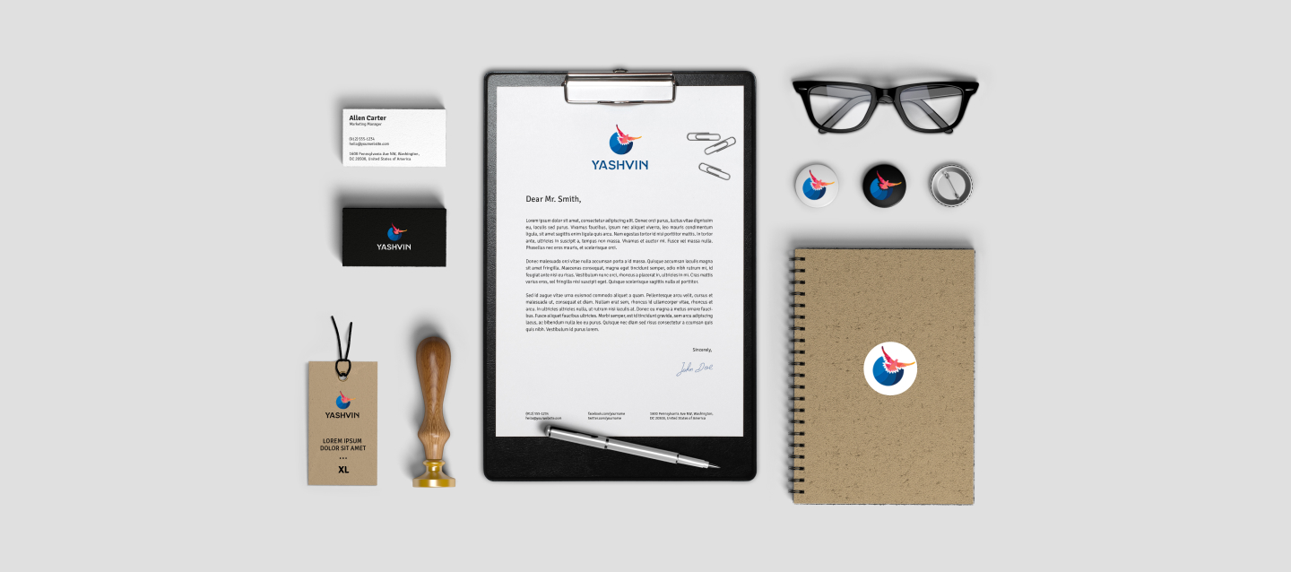
Branding
Stationery Design
Environmental Design
Social Media Designs
Brochure Design
Sector
Chemical
Client :
A well known dye manufacturer in India
What we did
Branding
Stationery Design
Environmental Design
Social Media Designs
Brochure Design
Brief
At the start of their next evolution, Yashvin had to say goodbye to their old identity. They had been a reliable and friendly dying company up to that point, but they needed something new to take them into the future. Their new identity needed to reflect their commitment to quality, their innovation, and their willingness to take risks. It needed to be something that would make them stand out in a crowded marketplace. Most importantly, it needed to be something that their customers could connect with on a personal level. stackmint understood their needs and helped them create a new identity that was everything they hoped for. With their new identity in place, Yashvin is ready to take on the future and continue delivering quality products and services to their loyal customers.
Logo Creation
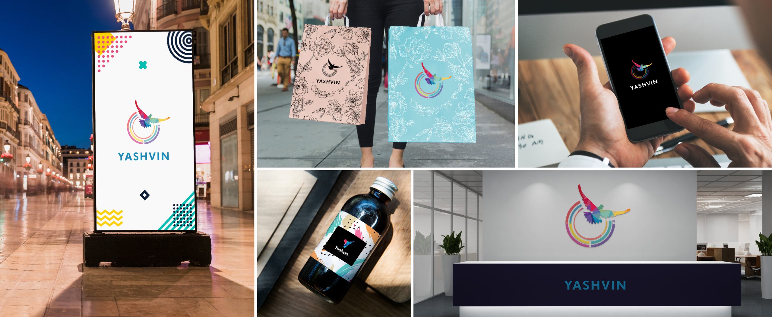
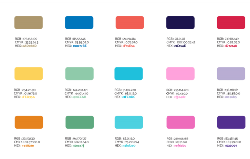
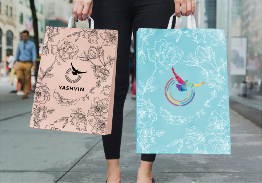
The design concept for this logo was drawn from dye coloring on a globe. The curved lines are graceful and complete, giving a sense of integrity and perfection. The circle shows the direction of progress and growth. Birds symbolise wisdom, peace, power, courage, longevity, good luck and happiness. The simplest logo with birds is instantly related to the service they promote. In this case, the bird symbolises the power of communication and the importance of connecting with others. The globe represents the global reach of the company’s services. The colors were chosen to reflect the company’s values of connectivity, community and creativity.